Mãozinha
UX | UI Design
Overview
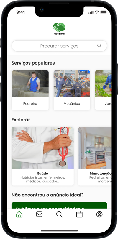
‘Mãozinha’ is a prototype app for searching and offering common services that came from a bad experience I had when I moved to Portugal: difficulty finding a reliable moving service.
This project was developed during my learning process based on the UX Design course “UX Unicórnio” by Leandro Rezende and aimed to apply theoretical knowledge in practice.
Roles
UX Research, UI Design
Length
3 months
Tools
Figma, Notion, Maze, Google Forms and WhatsApp
Project definition
The problem
The problem emerged from my experience: difficulty finding a reliable moving service in Portugal.
But after all, isn’t there a way where I can find several service providers in an easy, simple and reliable way? No. Then the insight came up: Why not an App?
The goal
Develop an App that provides easy and intuitive service searching and offering among brazilian immigrants in Portugal.
The scenario
Factors that enable the development of the project and that influence, directly and indirectly, how potential users behave were identified through research (detailed later), such as:
Demographic | Financial
– Growth of the Brazilian community in recent years;
– Increase in the number of Brazilians with financial difficulties;
Behavioral
– Search and find reliable service offers is not as simple as it could be;
– Cultural differences;
– Xenophobia.
Desk Research
Some data
– At least 252 thousand Brazilians were recorded living in Portugal in 2022;
– In the same year, the number of Brazilian immigrants who applied for repatriation almost quadrupled, according to the IOM (International Organization for Migration);
– In a survey of immigrants, the majority (81.7%) said they had already suffered some discrimination in public services in Portugal.
Analysis
Based on the data collected, I found a potential audience for the product (App). Furthermore, I understood that Brazilian immigrants, due to cultural differences and cases of xenophobia, feel more comfortable when socially interacting with their compatriots than with Portuguese.
CSD Matrix
What am I looking to know?
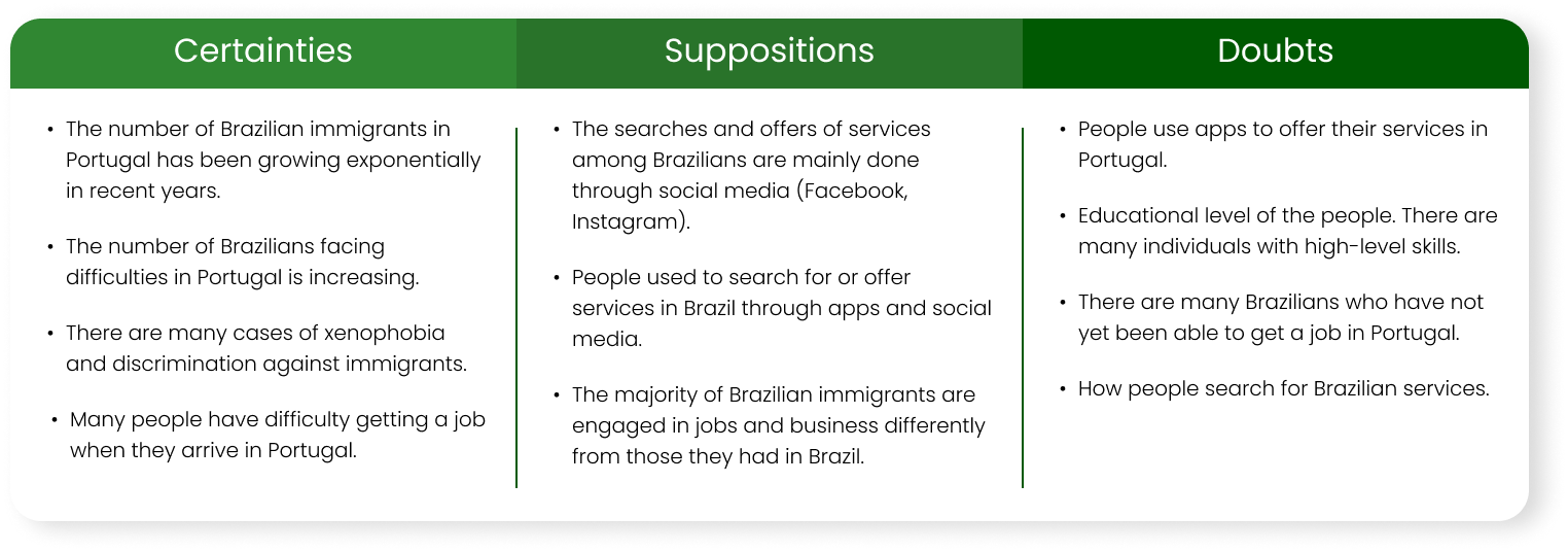
I used the CSD Matrix tool to organize my certainties, suppositions and doubts. And so, I defined a research plan, with three stages:
1st. Quantitative research through questionnaire;
2nd. Desk Research on Facebook;
3rd. Qualitative research through interviews.
Surveys
1) Questionnaire
I created a form using Google Forms to identify and better understand who these people going to Portugal are, such as their education levels, professional activities they used to carry out in Brazil, etc. This research was conducted to validate or not the suppositions and doubts from the CSD Matrix.
Results overview
Most immigrants participating in the survey tend to offer or hire services based on other people’s recommendations and social media posts.
On the other hand, most people used to use service apps when yet in Brazil.
Insight
Why not bring the Brazilian scenario to Portugal? I see an opportunity in it.
2) Desk Research
The research was carried out in groups on Facebook to observe the engagement of posts about service advertisements.
Parameters used: search in the 4 groups with the largest number of Brazilian members living in Porto; search for the term “services”; for the period between January 1st and 15th, 2023.
Results overview
There was an average of 48 posts per group containing the term “services”, 5 of these posts from people looking for services. The other 43 are offers.
Insight
A maioria das postagens, na minha visão, não transmitiam uma imagem profissional e confiante. Um ponto para se atentar quando prototipar.
3) Interviews
To map actions and behaviors related to service offers and demand, I split the interviews into two categories: one aimed at those who need a service and the other for those who offer it.
I interviewed 6 people from each category, some in person and others via WhatsApp, semi-structured, guided by questions based on the interviewees’ previous experiences.
Results overview
In addition to collecting enough information to elaborate the User Experience Map, I obtained valuable reports to define the personas, such as the financial difficulties of those struggling to find a job.
Personas
Who are these people?
Based on the information extracted from the research, I defined a persona for each category: service users and service providers. I explained their pain, needs, desires and also potential solutions.
User Jorney Map
What are your actions?
The experiences of our personas were mapped to visualize in an organized way their steps on a path, from the moment their needs emerge until a service gets completed.
The goal is to generate solution opportunities at each stage of this experience.
Competitor Analysis
Benchmarking
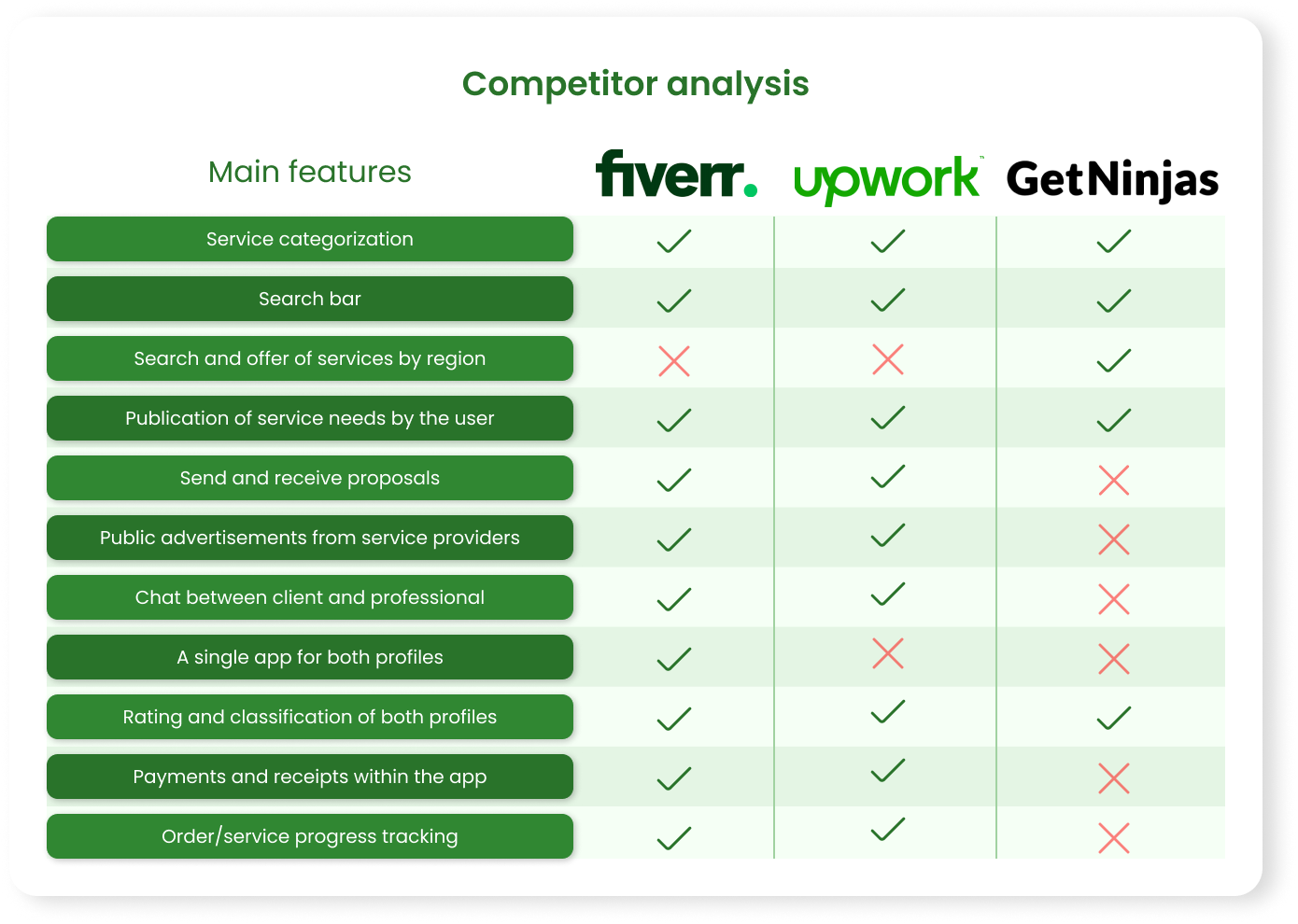
After analyzing the maps, I defined basic and essential functionalities for a good user experience which I believe can contribute to generating value for the product. So then we have the minimum viable product (MVP).
In order to have references, three “competing” Apps were selected to have their functionalities verified and compared: GetNinjas (Brazilian App aimed at services in general), Fiverr and Upwork (International Apps aimed at remote work).
Prioritization
Impact-Effort Matrix
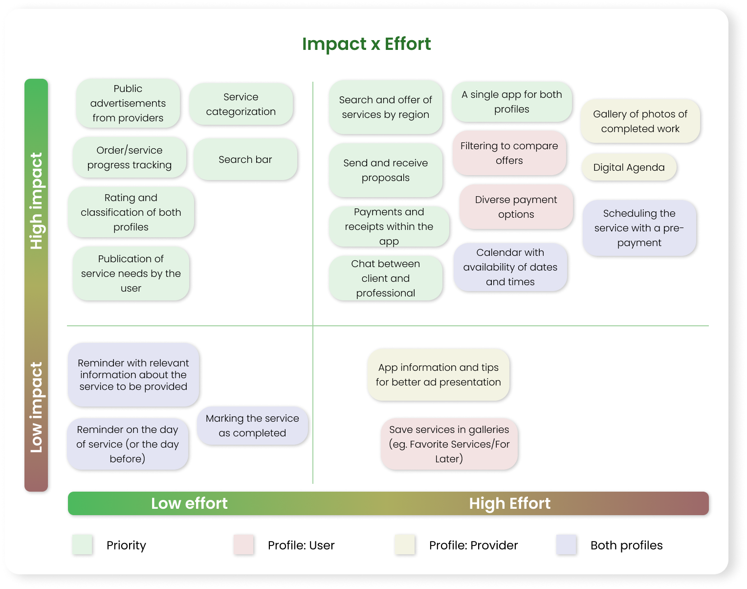
After analyzing and crossing previous studies, I defined the main features of the App. From this, I used the Impact-Effort Matrix to identify the highest priority solutions (those essential for minimum functioning and those that deliver greater value to the user with less effort generated).
Solutions requiring more effort but less impact will not be built at first and should receive attention later.
Prototyping
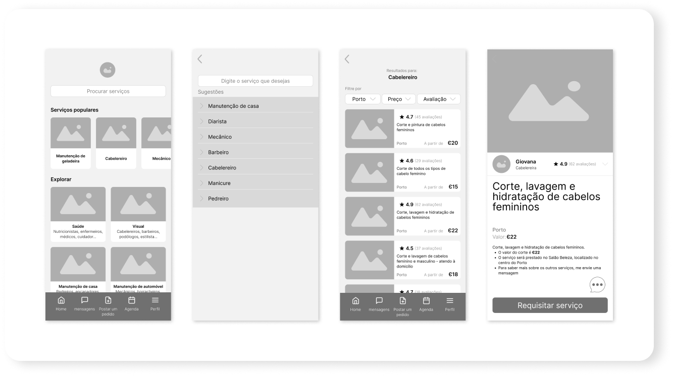
Wireframes
After the comparative analysis, I defined the Fiverr App as my main reference. Although Upwork has similar features, only Fiverr has client and professional profiles in a single App.
Having Fiverr as inspiration, I designed the App’s Wireframes and flows in Figma and used Google Material Design as guidance.
Usability Testing
Enhancement
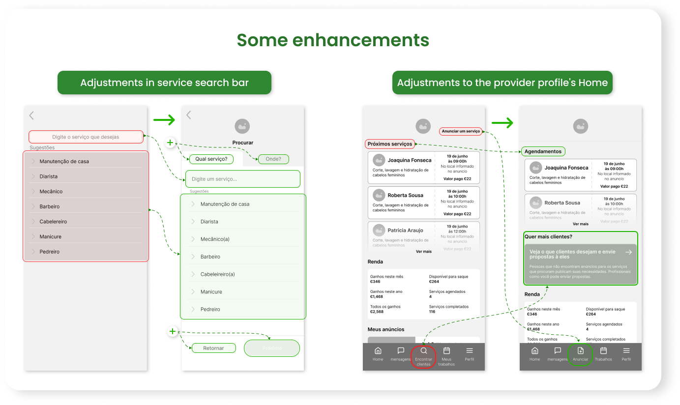
With the Wireframes created, I conducted three usability tests until I reached an acceptable version.
Five people were recruited for each test. At the end of the tests, the results were analyzed, insights were generated, and adjustments and corrections were made to the prototype so I could apply a new test.
The tests were conducted on both profiles, service user and provider, with three tasks for each focused on the minimum functionalities of the App. An acceptable prototype was reached when all test participants, directly or indirectly, completed all tasks.
Results overview
In the first test, 66% of all tasks were completed, directly or indirectly. The average time spent to complete each task was 33 seconds
In the second test, the percentage of completed tasks was 86%. The average time spent to complete each task decreased to 21 seconds.
In the third test, I had 90% of the tasks completed and an average time of 18 seconds.
The next step is to build a high-fidelity prototype.
Interface Design
Logo
I created a logo to incorporate it into the App’s visual identity. The logo is a handshake, representing the closing of a deal. I used green as the primary color because it is present in the Brazilian flag, it is a positive color, and it reminds money.
‘Mãozinha’ (Little hand) is the name of the app, taken from the brazilian saying ‘Give me a little hand here.’

Colors
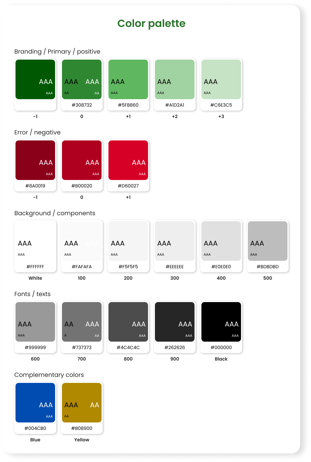
The primary color is green. Colors for background, components, and texts range from white to black. I opted on a smaller color palette to convey a sense of simplicity.
Typography
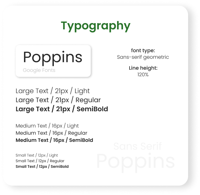
I used the ‘Poppins’ font from Google Fonts, which is quite popular. With a scale of 1.333 – Perfect Fourth, we have font sizes of 12px, 16px, and 21px for the app, with variations of Light, Regular, and Semi-Bold
Icons
The icon design has a maximum diameter of 22x22px, a 1px safety area, and a 2px line thickness. It features straight lines with rounded corners.
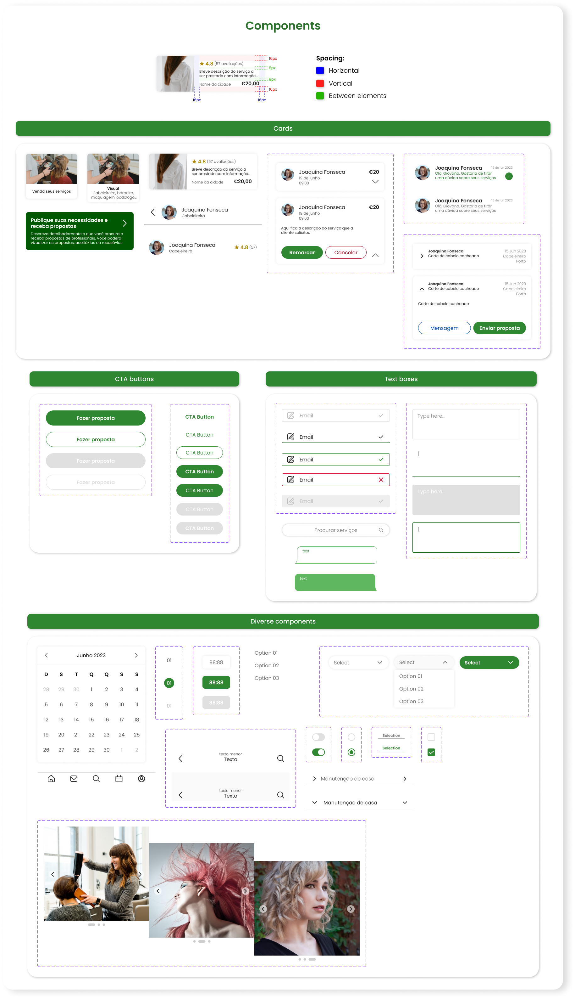
Components
The components were designed with spacing of 8px or 16px between elements, all responsive for larger devices. The corners are rounded to add smoothness to the design.
High-Fidelity Prototype
The App
Finally, the high-fidelity prototype was built based on all the knowledge acquired throughout the project.
Flow 1) Service User
Flow 2) Service Provider
Flow 1) Service User
Flow 1) Service User
Conclusion
Learnings
Indeed, it was a great challenge for me. Leading the project alone involved a lot of work, but it expanded my mind.
I came to understand in practice that sometimes what seems obvious to me may not be to someone else. During the research and testing phases, I identified errors from the user’s perspective that I didn’t see as the app’s designer. I learned to let go of what I had already built in favor of the user, after all, they are the ones who will use the app, not me.
Next steps
From here, we would work on the functionalities individually, in the form of Sprints. We would refine the flows already created and build the functionalities that we defined in the Impact x Effort Matrix. We would also work on responsiveness for tablets and web.
Thank you!
I would like to thank the UX Unicórnio Program for the knowledge shared, the people who contributed with me (interviewees and testers), and my wife, Fernanda Penna, who provided me with all the support to complete this project.
